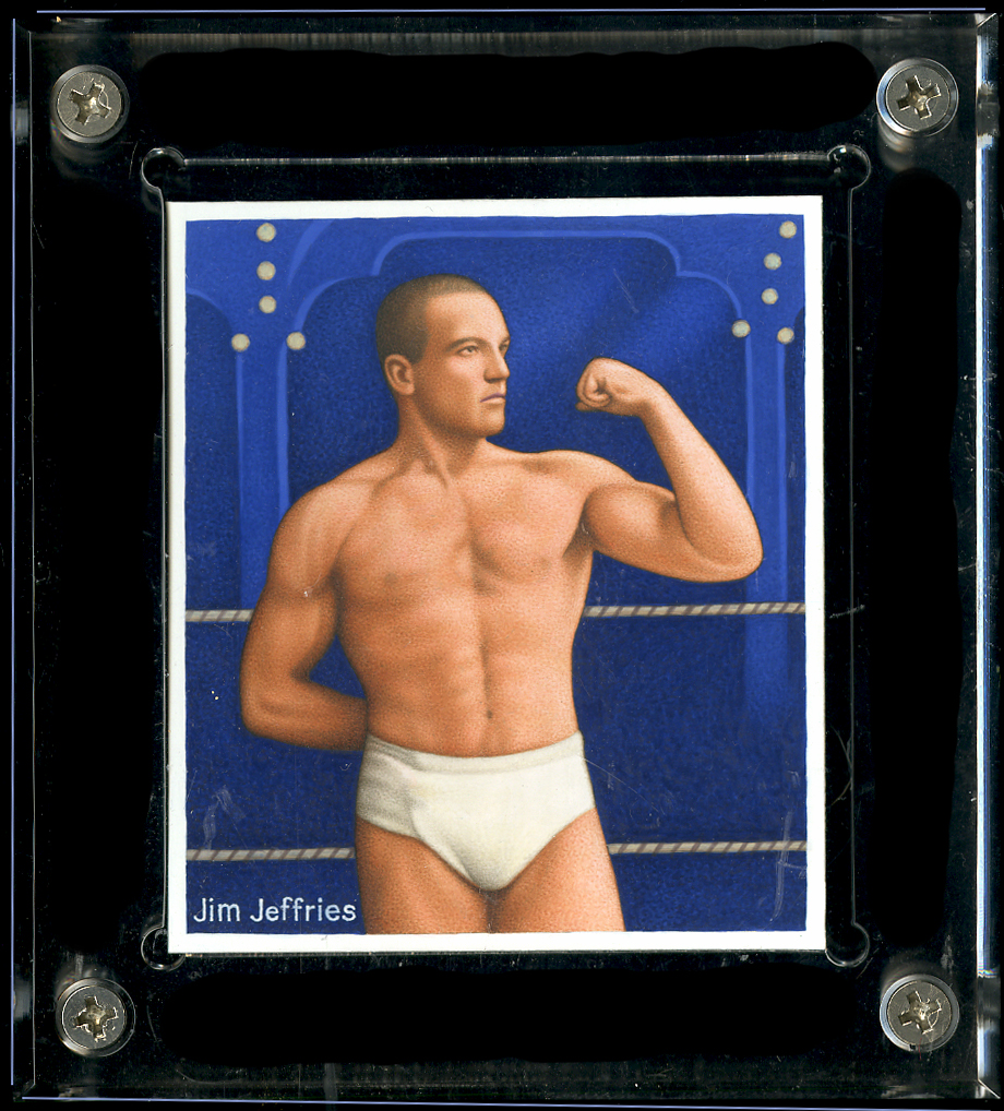
I’m really regretting that I chose white for the early boxing trunks for obvious reasons. It is a beautiful painting, though, of a great boxer. Should I change the color for the card, when it is made? Let me know in comments below.
I’m really regretting that I chose white for the early boxing trunks for obvious reasons. It is a beautiful painting, though, of a great boxer. Should I change the color for the card, when it is made? Let me know in comments below.

Its an original card and he is depicted in a different time…If this was the original color of boxing attire back and a day, then stay true to the time…If the modern day viewer is affected by their perseveration with “tidy whiteys” its their insecurity and will probably not bid on future boxers…..Thats fine
LikeLiked by 1 person
The James J. Jeffries Khedival (often misspelled as Khedivial) Prize Fight Series shows “The Boilermaker” with an extra wide belt featuring the American flag. It would be a colorful and somewhat unique way of breaking up those “tighty whities”. Regardless, it’s a lot better than Billy Papke who was known to fight just wearing a thong! (See Papke vs Ketchel 4.) Yikes!!! No matter what you decide, it’s still a beautiful painting and will make a beautiful card.
LikeLike
I’ve seen those belts with the flag motif and think that they are great. This has my vote so far. The thong is out, sorry! Charles
LikeLike
What? You don’t think Jim Jeffries looks great in his tighty whities? 🙂 Perhaps something that tightly cut was the style of boxing wear back in the day, but, yeah, now that you mention it, it’s hard to look at the image without seeing him as being in his underwear. Something other than white might work better for the cards, but it would have to be a color that doesn’t get lost in the deep blue background
LikeLike
Great card/great boxer. I’d suggest leaving it as a chase card/ print variation. Possibly showing a little blood stain on another one as a supper chase card, then make the rest with another color that doesn’t quite look like a wrestler from the 50-60’s. Either way, I’d still want it for my collections.
.
thanks and keep up the great art.
bc
LikeLike
Ha, I think that would be the first time that I’d be adding blood to a card but I will think about it. I do like variations and I know others do, too. I don’t really like making variations that are purposely impossible to find; just working through the normal processes and practices means that once in a while there are inadvertent ones. Spelling, etc., are the most common. I try not to correct mistakes unless they are so blatant that I am completely embarrassed. Thank you, Charles
LikeLike
Yeah, the whities are all I see now when I look at the card. I think I really should change it.
LikeLike